
Qui was the first platinum extra anejo tequila (meaning it has all the complex, rich taste and texture but without the gold color that many people associate with too many bad tequila experiences.) Created for people who enjoy discovering things and playing off it's clear color, our positioning leaned into the notion that there's more to Qui than meets the eye.

Our logo kept the Q premium and mysterious with the addition of a keyhole. What's behind it? Those who try will find there's more to Qui than meets the eye. This logo lead to our brand tagline:
Taste the unseen.
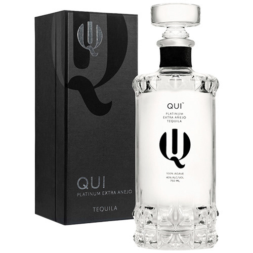
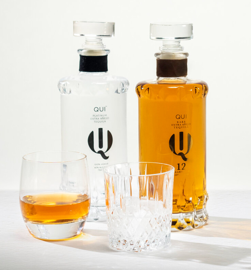
Packaging and bottles kept with the mysterious vibes. The bottle sets a premium profile and stands out within the category - the stopper lid has the feel of a luxury bar service. Overall we went for a touch of "secret society."