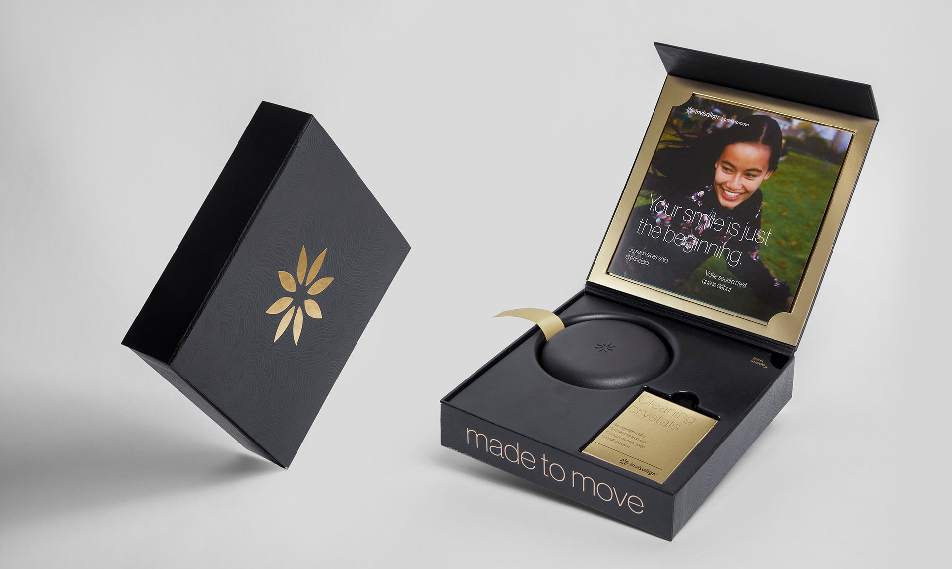
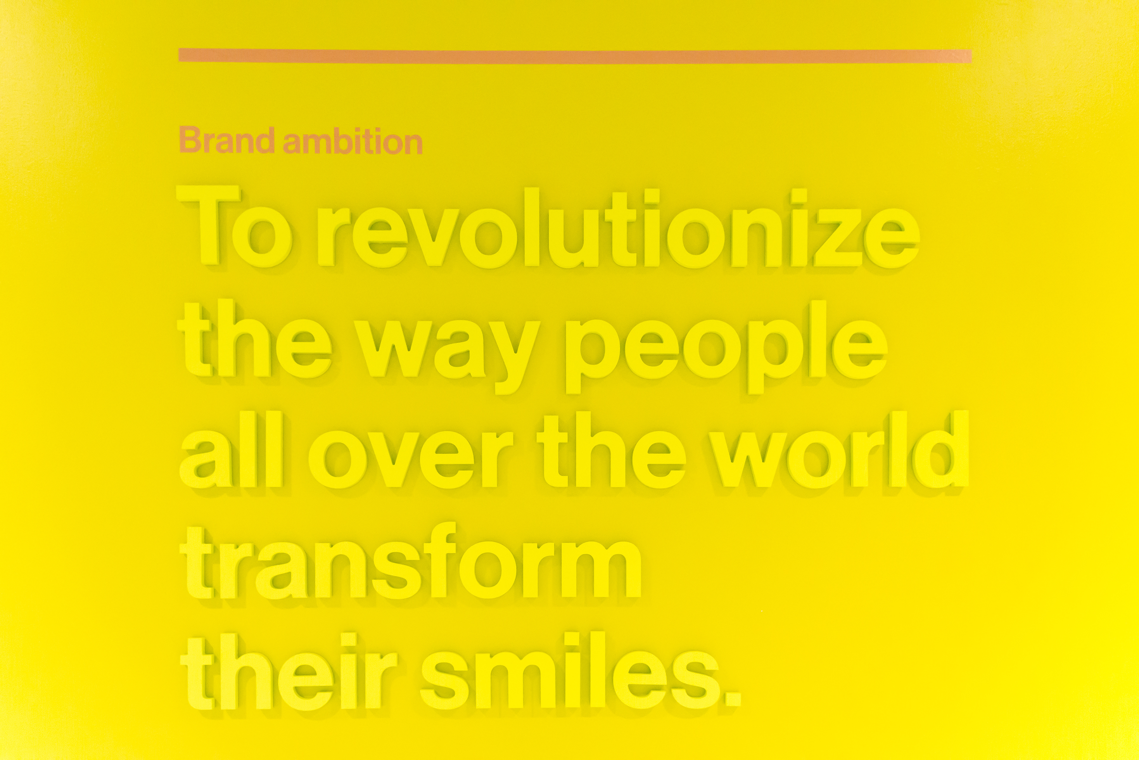
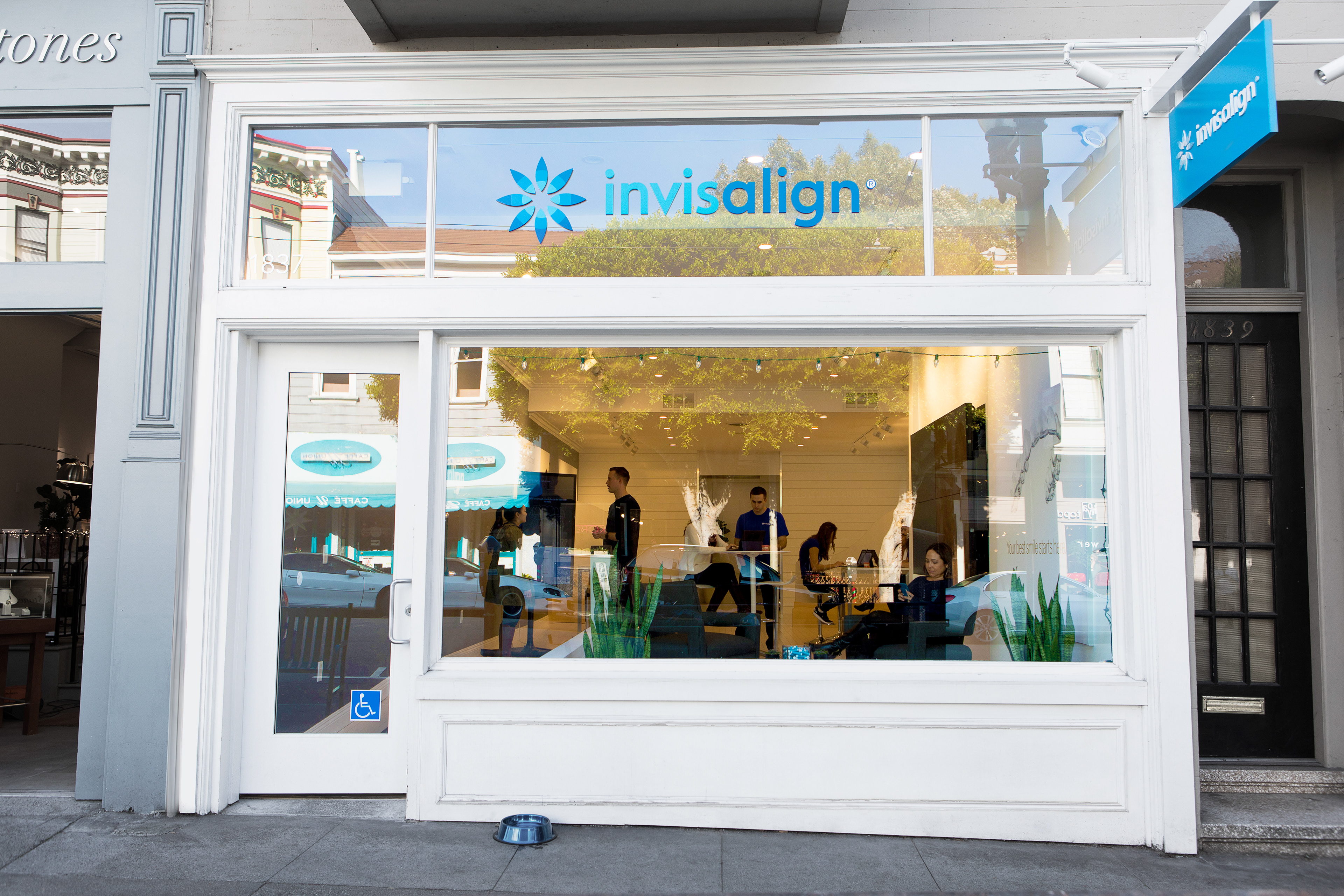
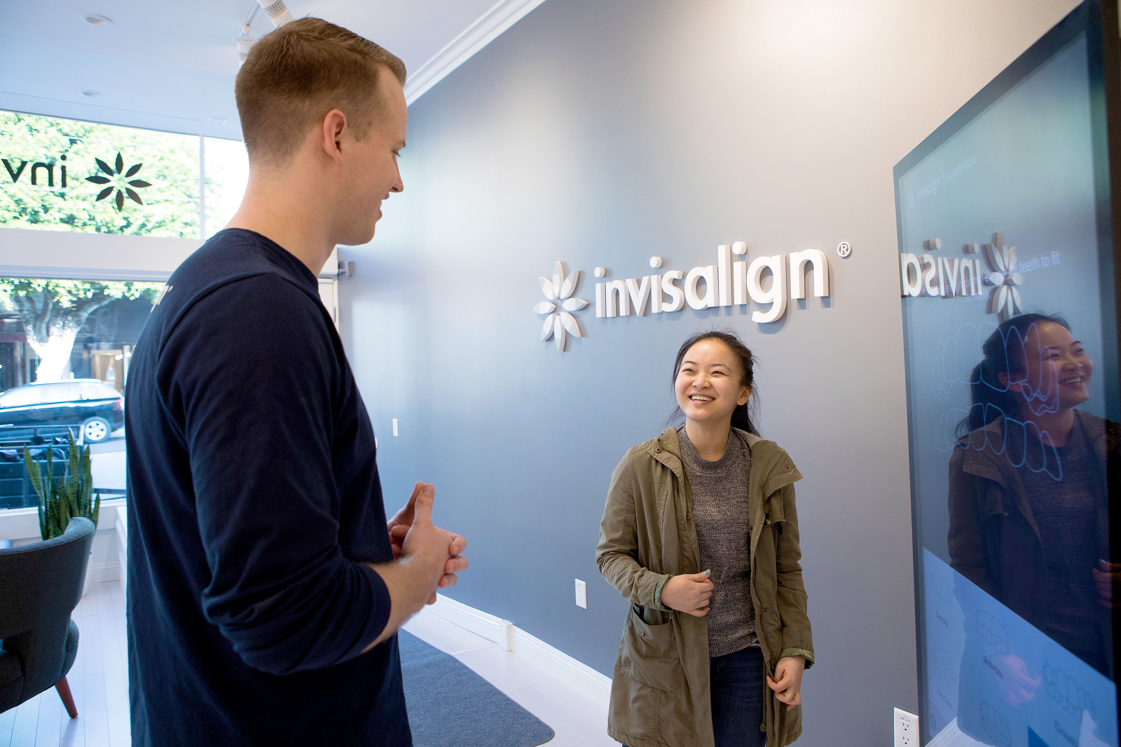
For years, Invisalign was the only brand in its category and only needed to market to professionals. But new emerging brands (including DTC) meant Invisalign not only needed a consumer brand, they needed one that would also speak to all their audiences and professionals. We rebuilt the Invisalign brand from the ground up with "Made to Move" which came to life in advertising, a new premium brand ID, new packaging, website, apps and the brand's first retail stores.
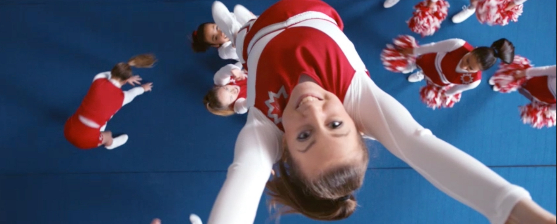
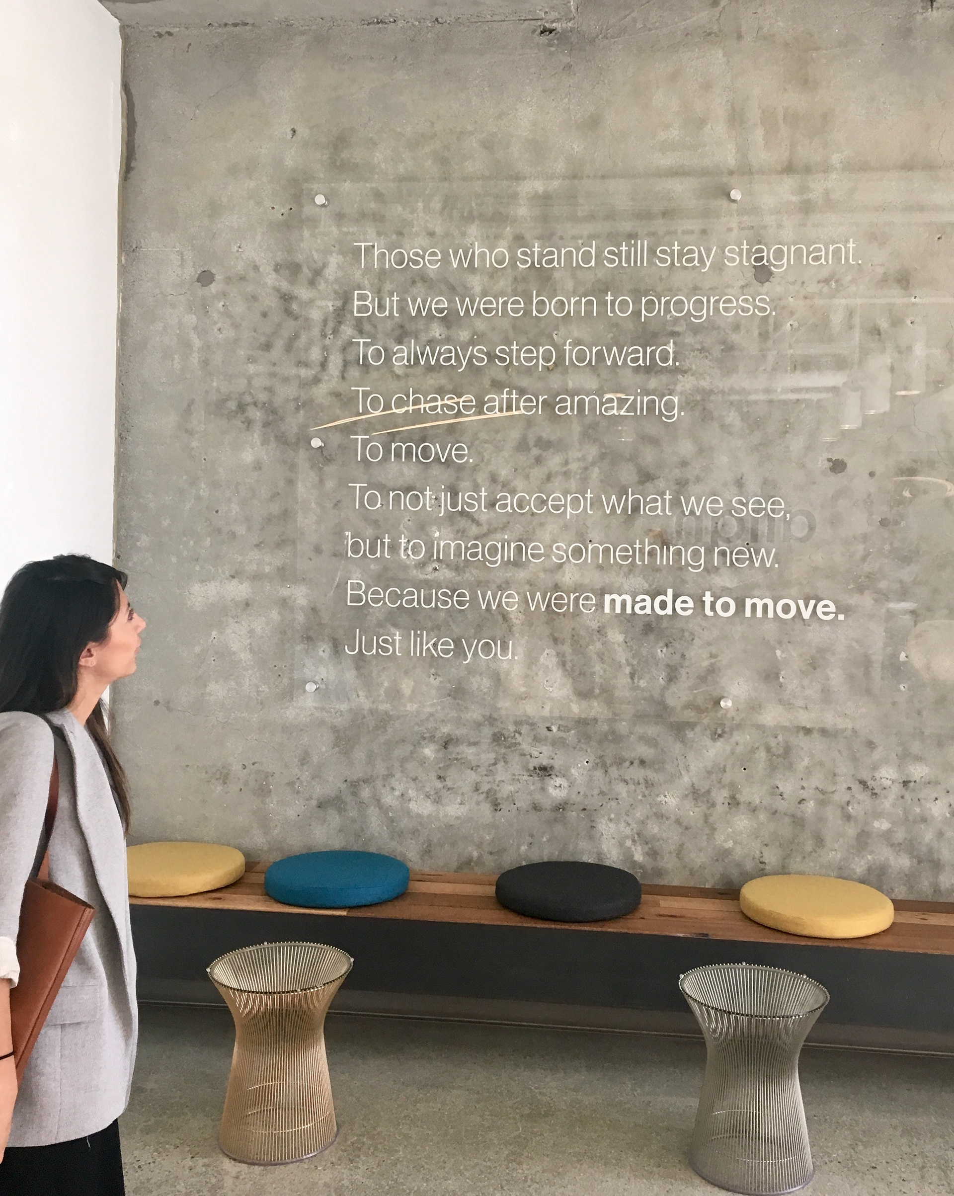
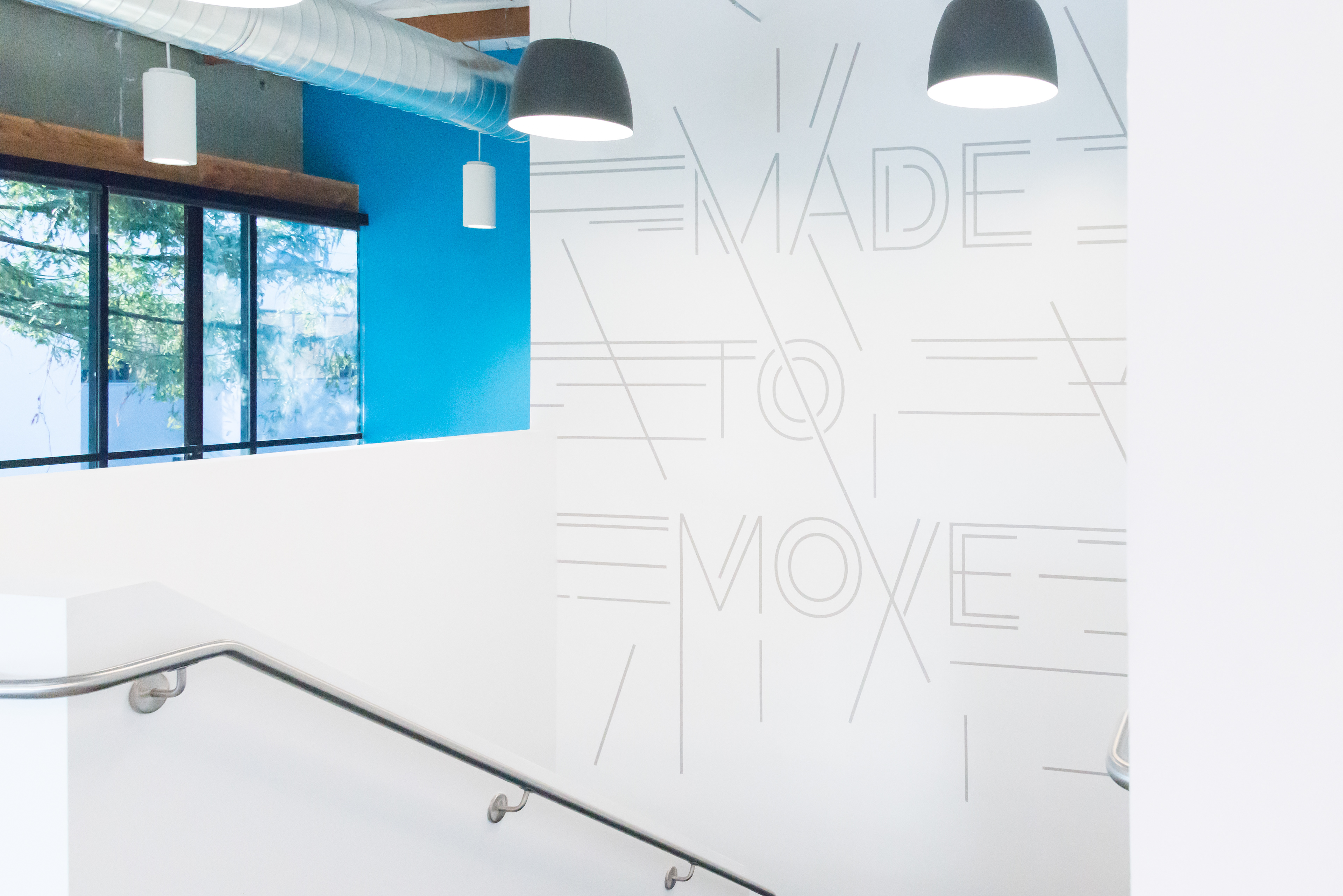
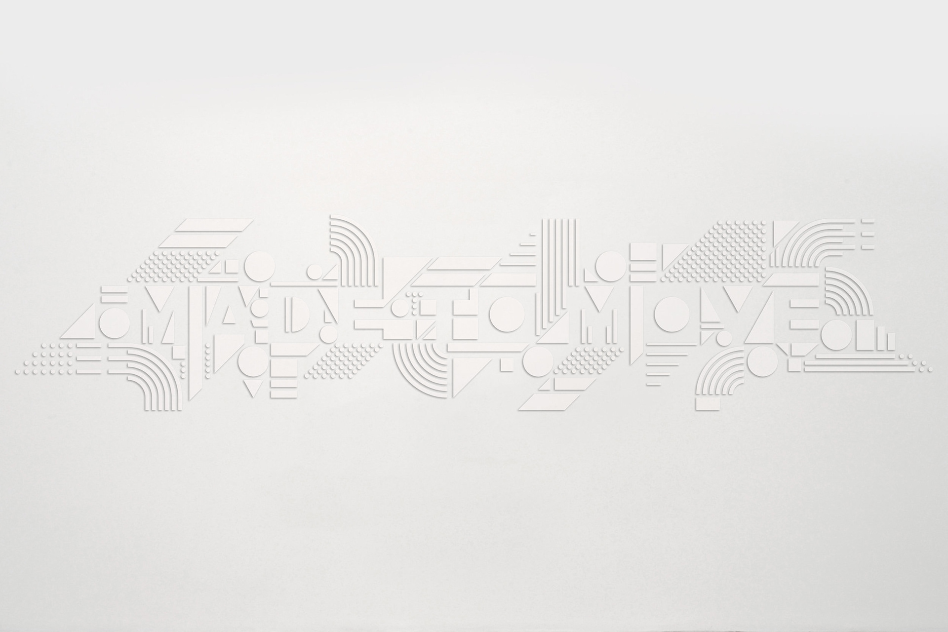
Regardless of age, gender or photography, we all see a great smile as a way to move forward in life. "Made to Move" is a rallying-cry to find the next amazing version of yourself.
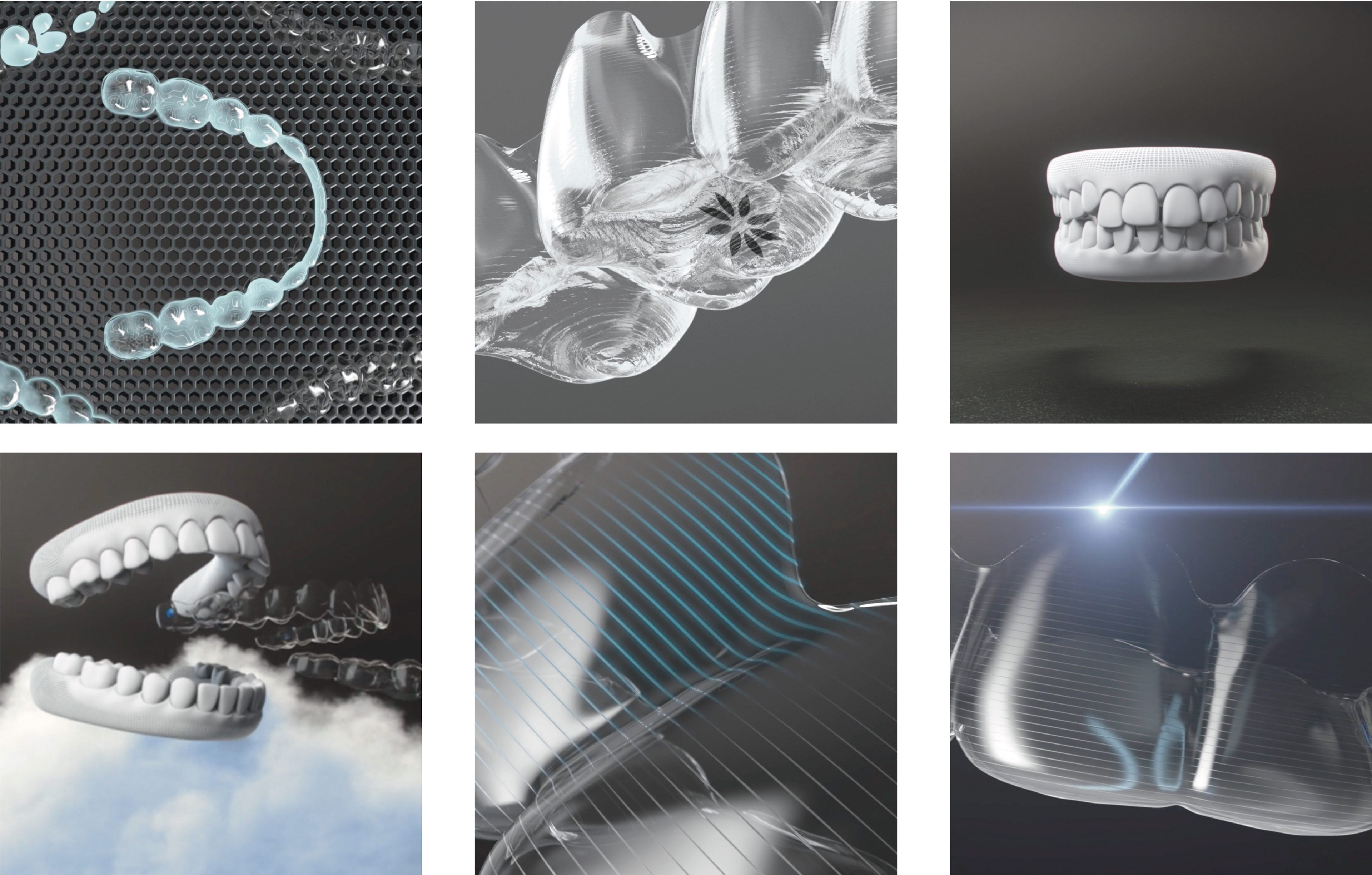
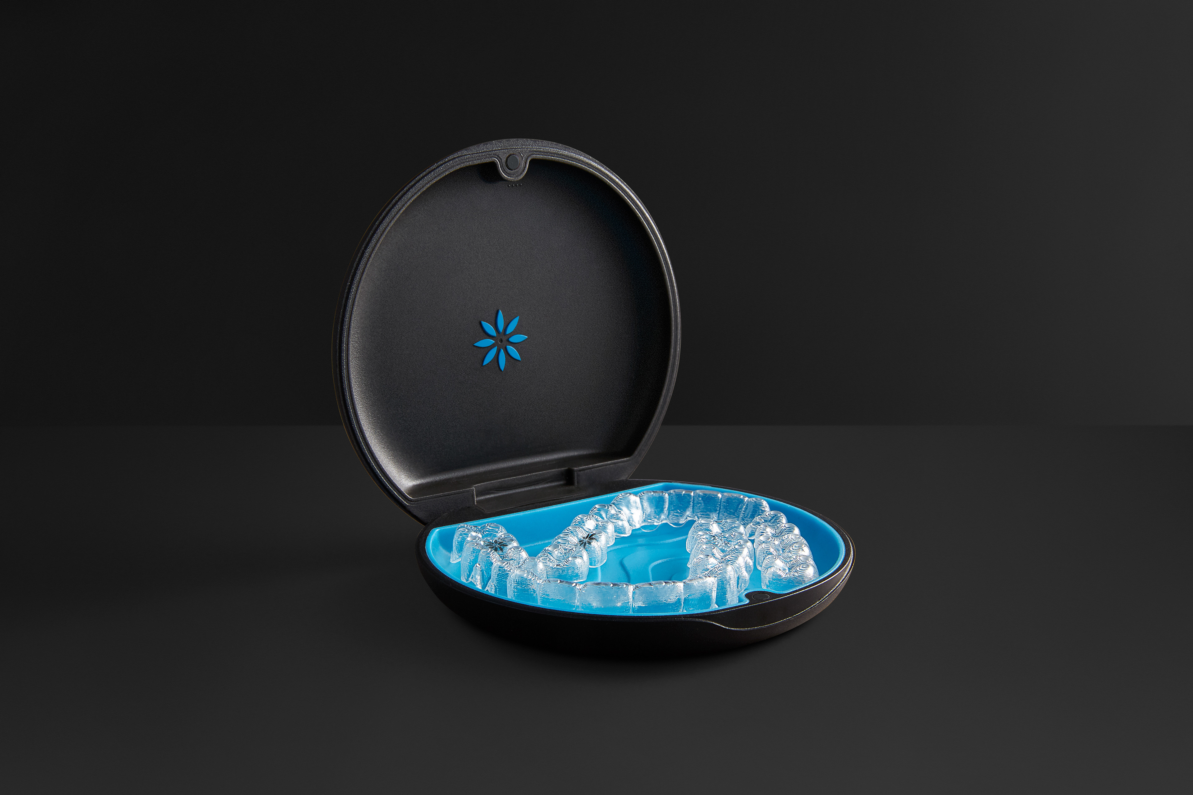
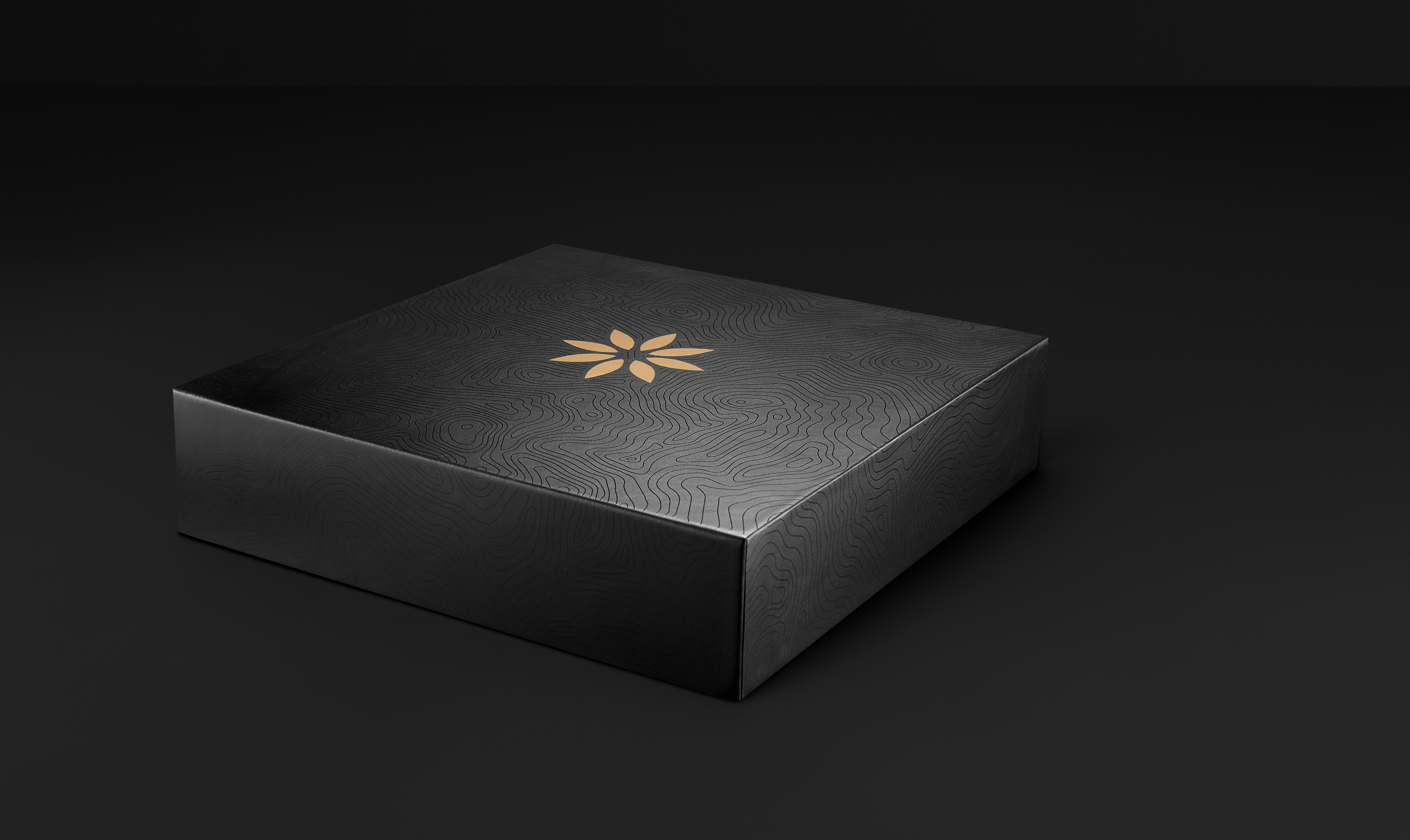
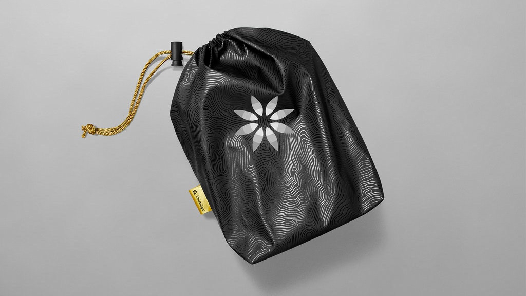
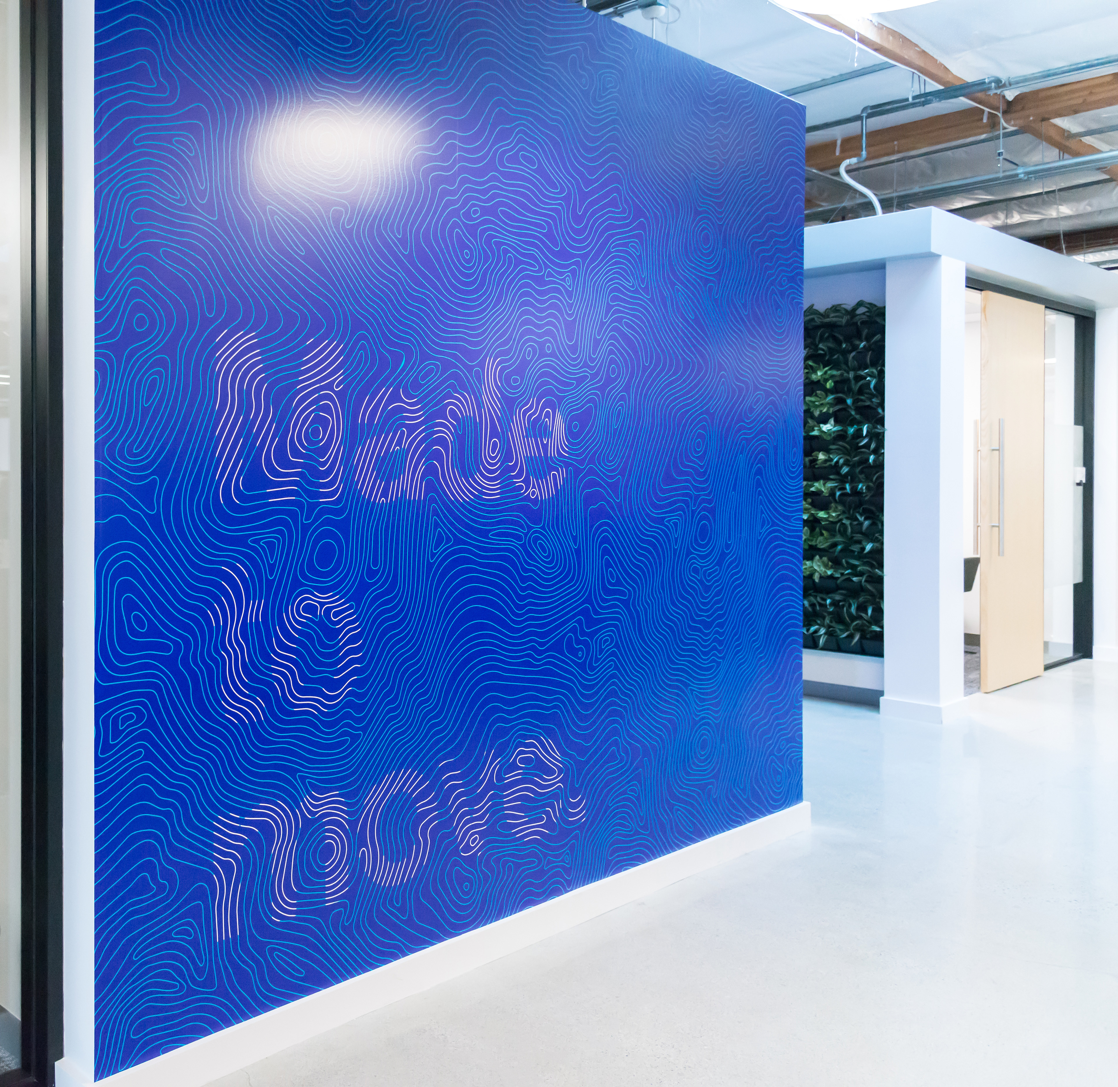
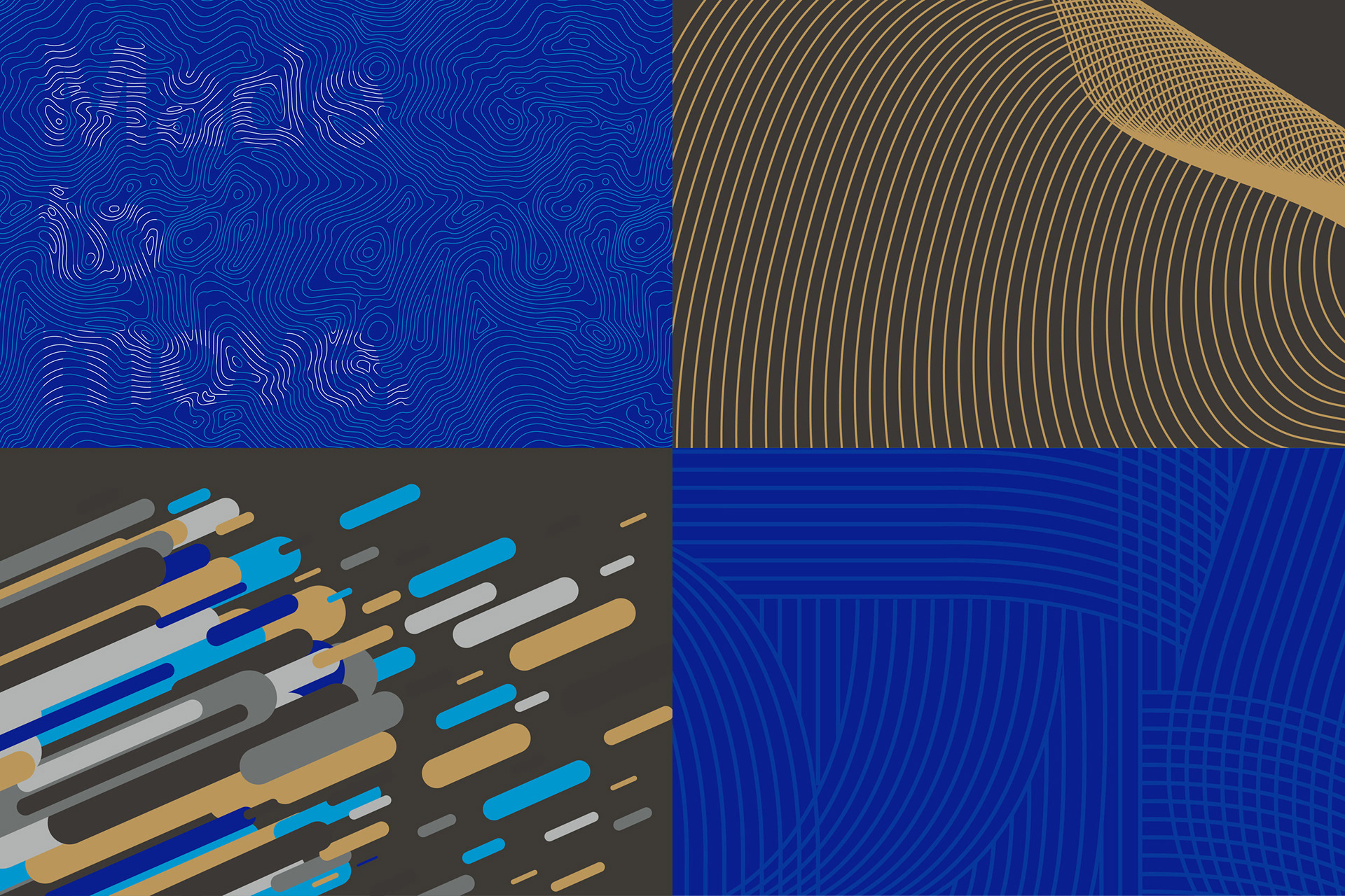
We gave Invisalign a brand presence more fitting of its premium status. Use of black, gold and cues more often seen in technology brands, took it out of medical feel and into a more prestige identity.
Brand ID Design: Jen Orth, Diana Quenomoen, Anna Morse Packaging Design: Diana Quenomoen
We got to design every aspect of the brand. Walls at corporate HQ, their first retail stores experience and how the brand shows up at trade-shows. The brand voice comes through in every touchpoint.
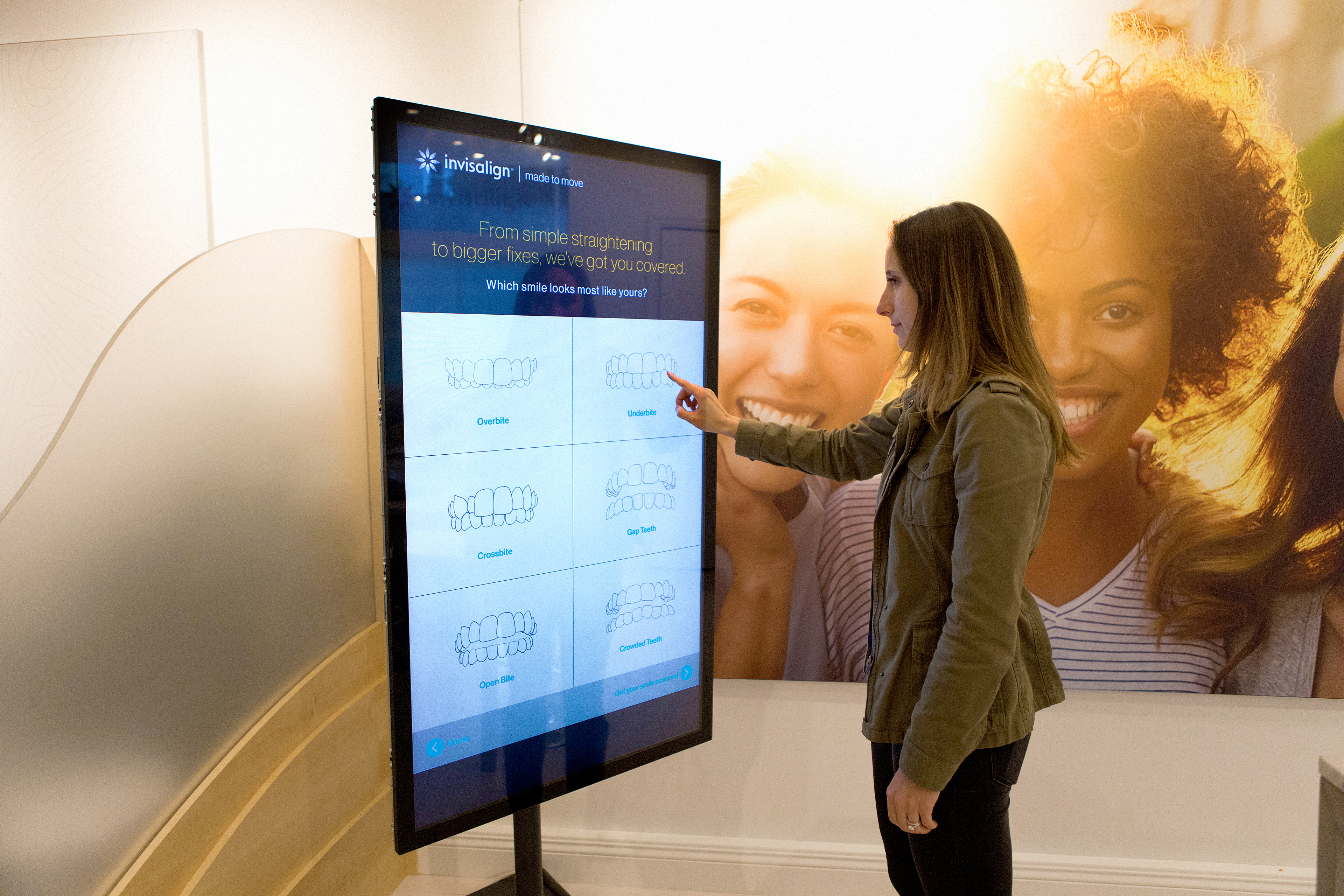
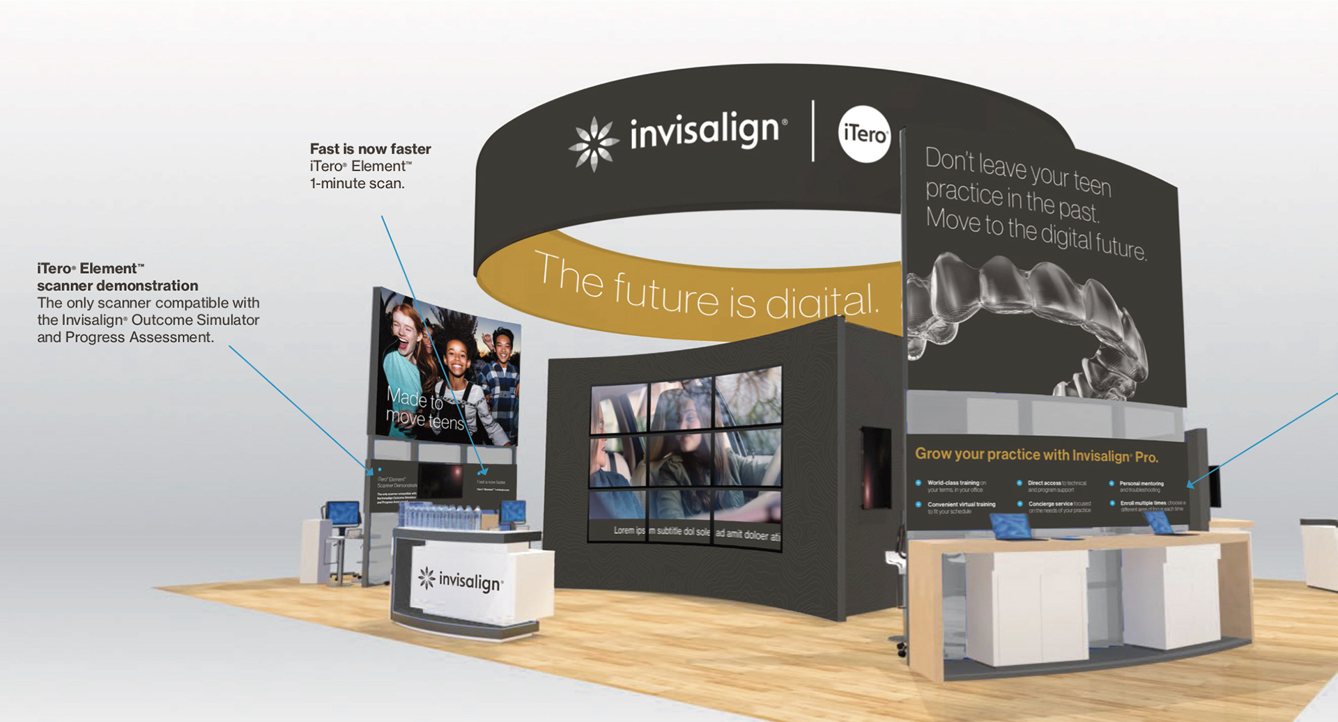
This is a medical category and it can get kinda grody. But we set out to make every touchpoint as high-tech and premium as the Invisalign product. We created aligners in CG and even showed things like moving teeth in a more elevated, cool-way.