I love design. I see it as a fundamental part of the brand experience and I've been lucky enough to partner with some incredible designers.
Invisalign is a 5k purchase, but doctors were giving them out in a 5¢ box. It was crucial to make the experience of receiving your first aligners, as premium as the product itself. Soft-touch box and bags are anything but "medical." And the new black carrying-case looks like a fancy compact - and set off a frenzy of "where can I get one??!!." The new design elevated Invisalign from a medical device to a status accessory.
Packaging Design: Diana Quenomoen
Invisalign looked like every generic medical brand - white and blue. Black with pops of color and sophisticated type-face elevated the brand to a look more fitting of its premium statue. Even collateral pieces for orthodontists and dentists looked aspirational and cut thru the clutter.
Designers: Jen Orth, Diana Quenomoen
Sometimes to do cool things, you need a bit of a daily push, so we created this series of "Cubespirations" to liven up the workspace (and hopefully stick around past the holiday season.
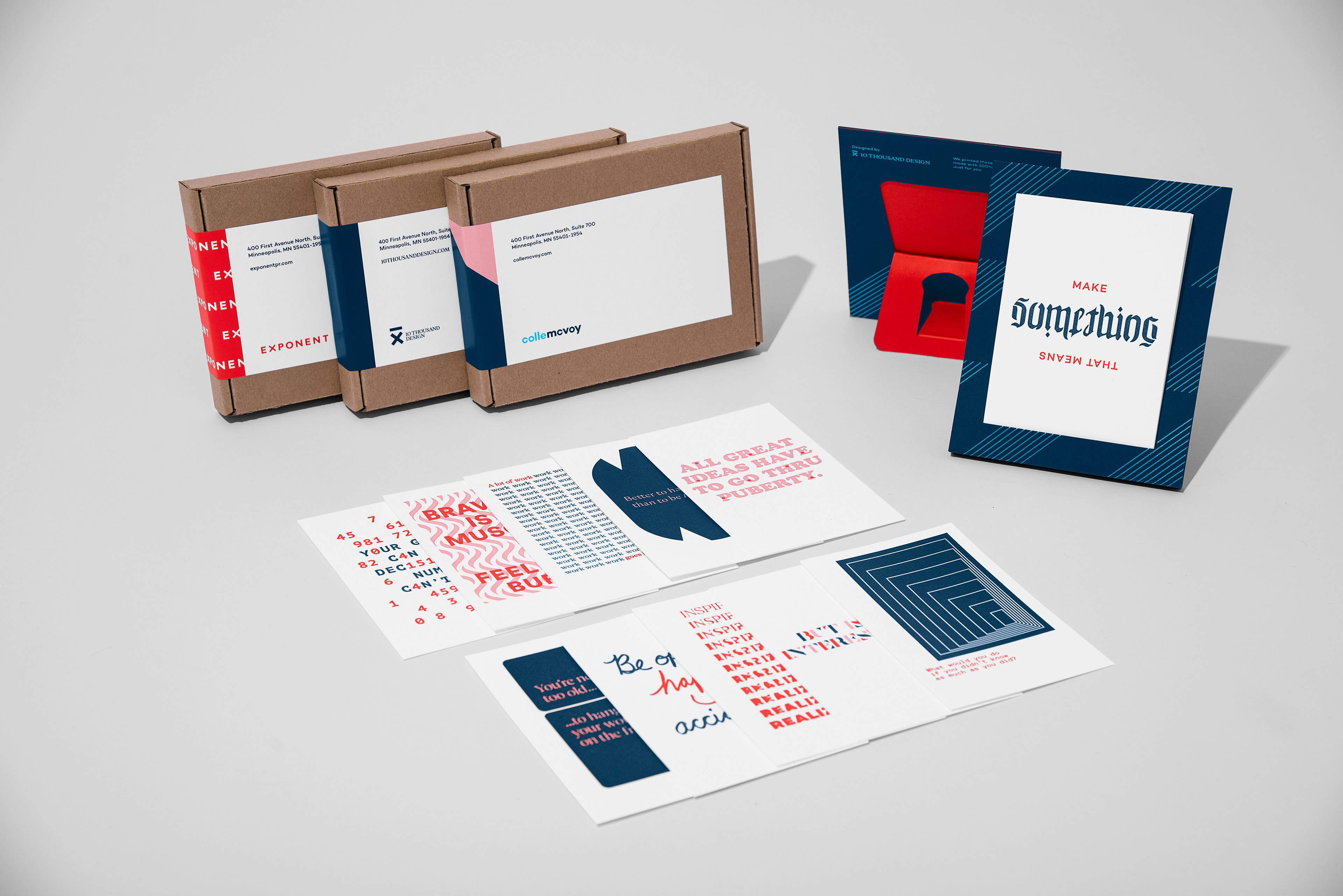
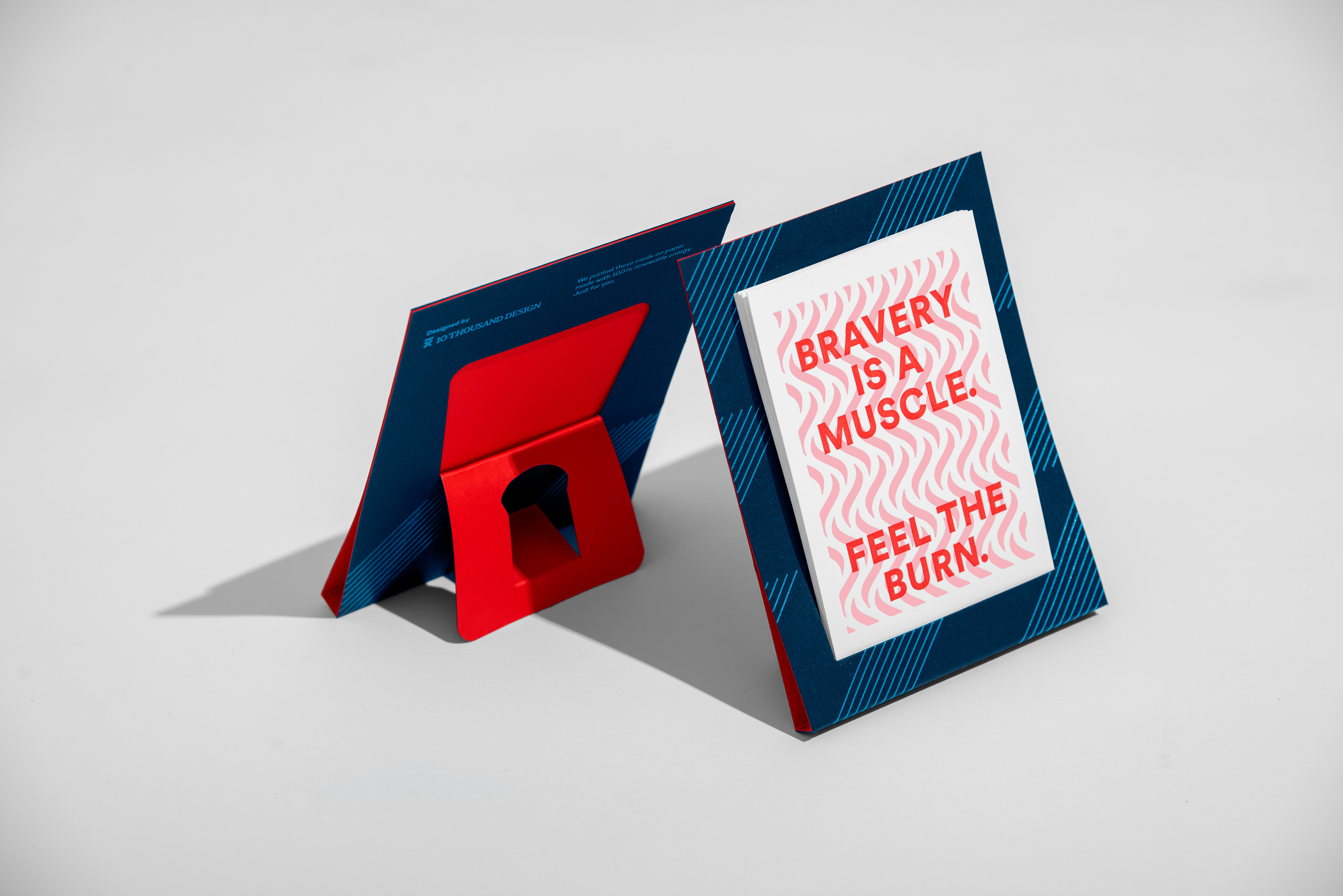
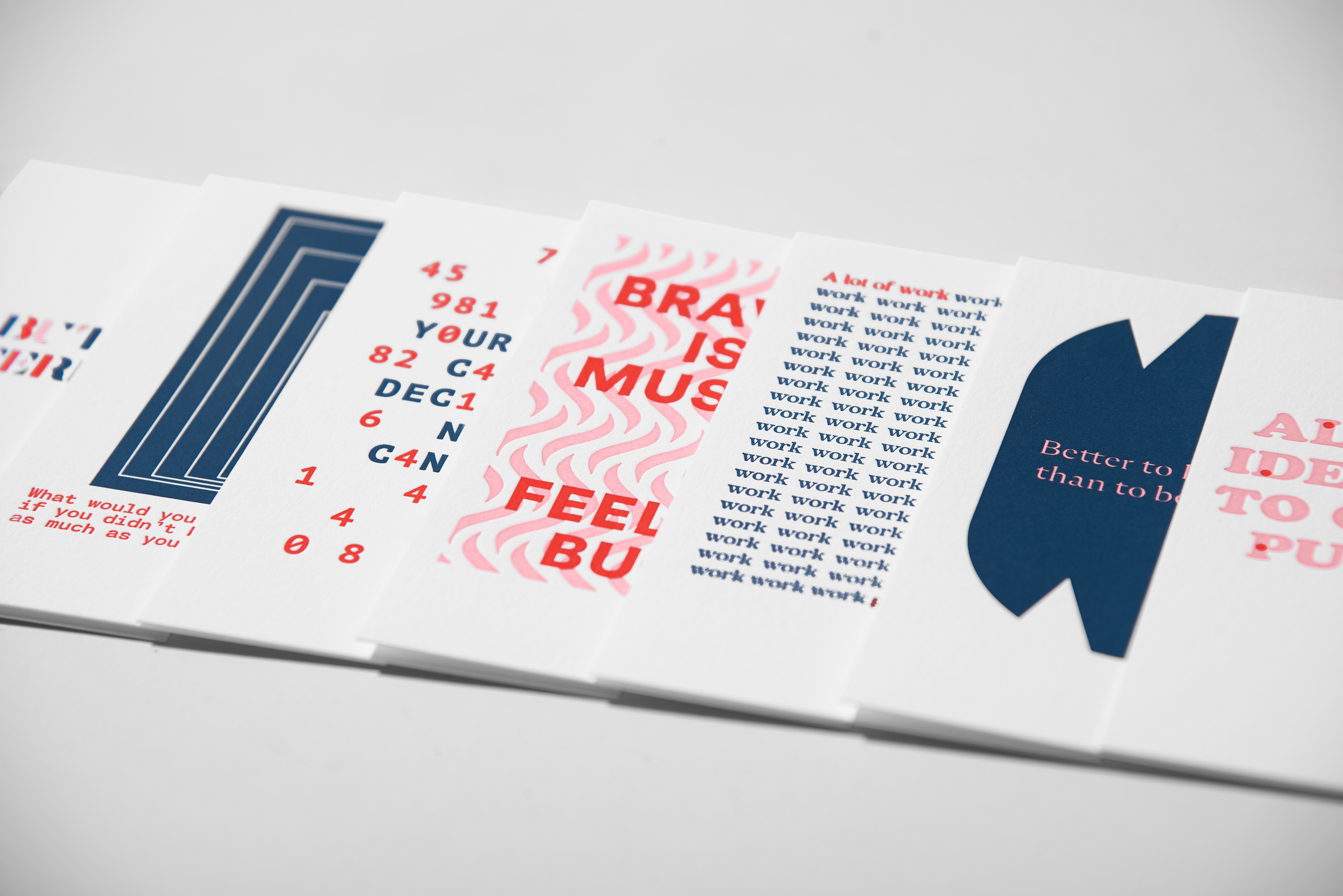
Designers: Matthew Ulstad, Adam St. John. Copywriters: Erik Kvalseth, Zach DeBlaey, Me
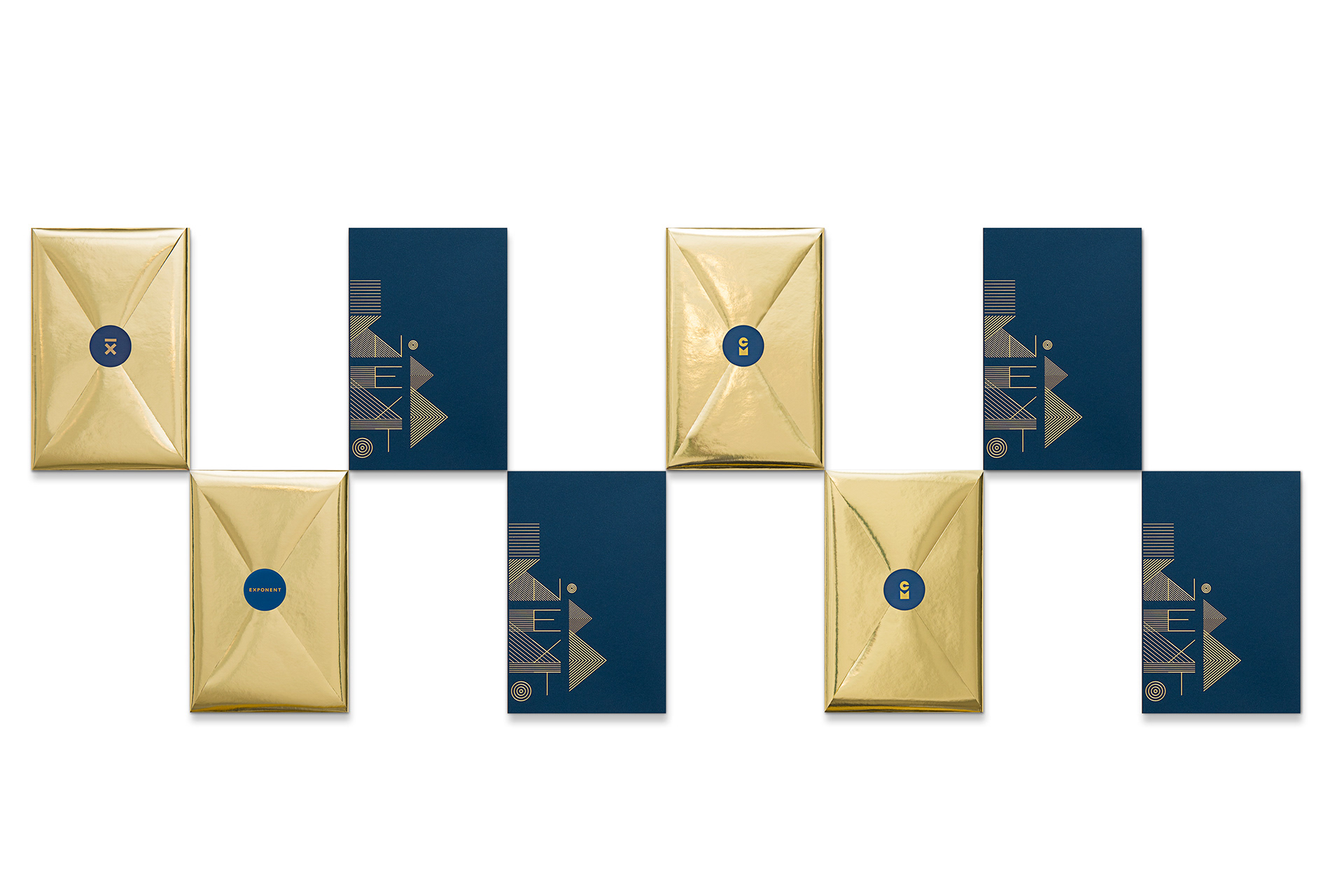
Colle McVoy's mission is to help brands find their next. Big changes happen in small steps, so to help our clients reach their Nexts in 2017, we created this special action journal. Pages were organized to break big goals into bite-sizes and inspirational quotes were peppered throughout to provide some fire.
Designers: Jacob Boie, Sam Soulek. Copywriter: Eric Hansen
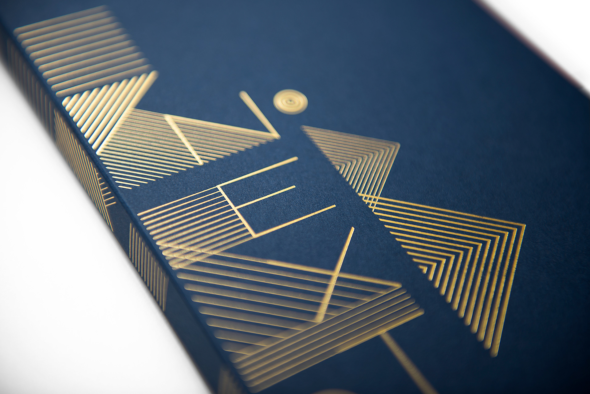
Total rebrand of Pacha Soap Co. See the whole story on its own project page.
Designers: Lydia Bickal, Dustin Yerks Writers: Michelle Cherland, me